Friendship App Design
UX Bootcamp product design exercise. A rethinking of the friendship app experience.
Objective
Design an app that connects individuals interested in a specific experience and facilitates the transition to real-life hangouts.
Approach
Dating apps have changed how we date and highlight the tremendous impact of technologies on social connections. Multiple companies have applied this social model to the friendship market. However, the features of the dating model are not optimized for developing friendships - connecting over similar hobbies and spending time in person.
My process consisted of 3 steps:
01: User interviews and competitive audit
02: Design principles & UX
03: Prototyping and usability testing
01 User interviews and competitive audit
I spoke with twelve individuals to define their needs around making adult friendships and identify their pain points with the available friendship apps.
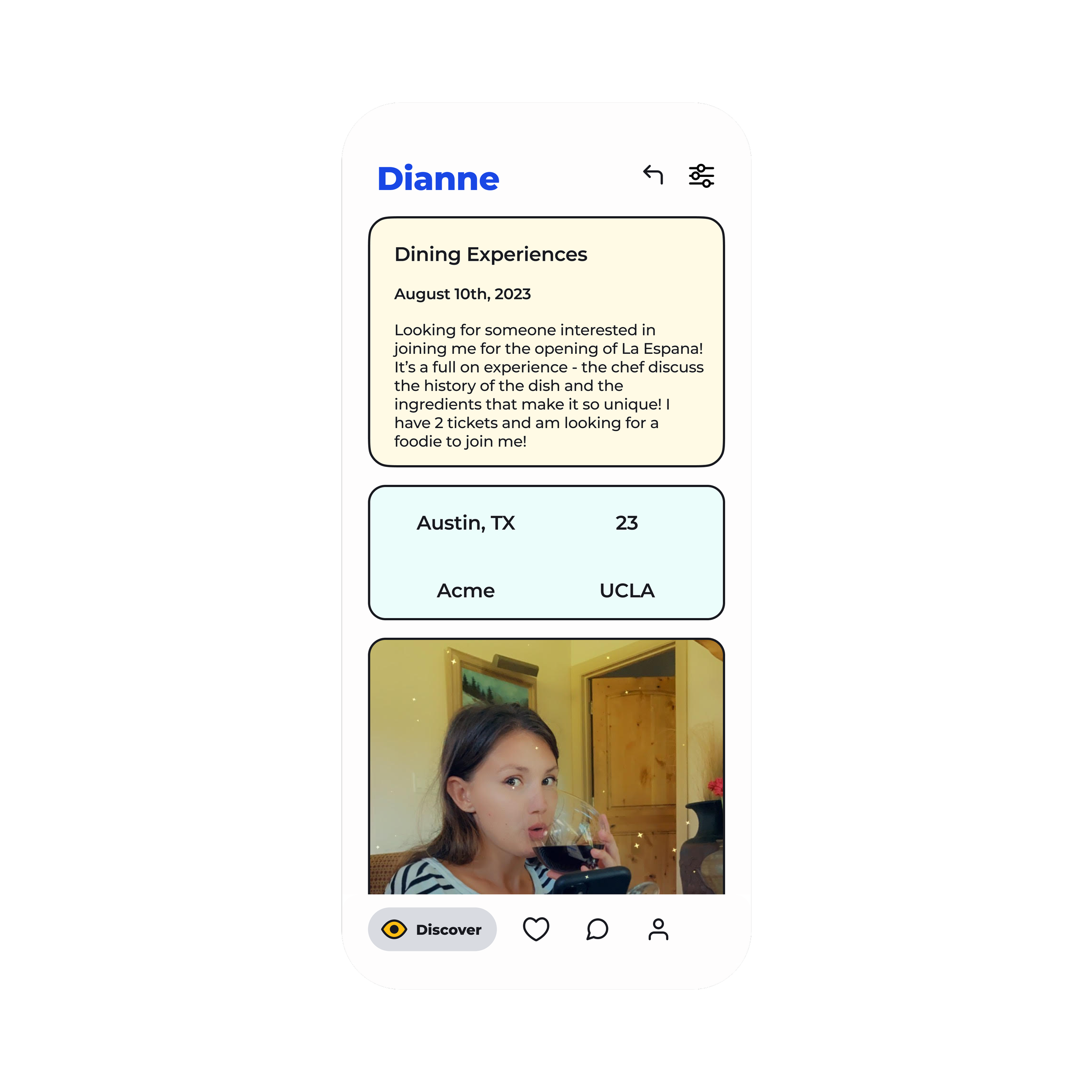
While photos are important to users’ assessment of potential matches, users didn’t base their compatibility with someone solely on looks, in fact, unlike in dating, physical appearance wasn’t even in the top 4 criteria. They wanted an app that allowed them to find individuals interested in doing a specific activity with them.
Most Friendship apps' algorithms show users' profiles of potential matches in their proximity. This approach doesn't help assess compatibility between two users, which is a big pain point for the users I interviewed. The only app that focused on connecting individuals interested in the same things was Meetup; however, the app didn't focus on connecting two individuals, so users felt intimidated going to these big group events.
Companies considered in the competitive audit02: Design principles & UX
Design principles:
Conversations should come naturally from informative user profiles
The design should provide the tools and knowledge to inspire confidence in the users.
There should be minimal stress involved in planning in-person meet ups.
UX:
Friendship apps needed a more efficient matching function that was simplified and provided users with more detail about their match.
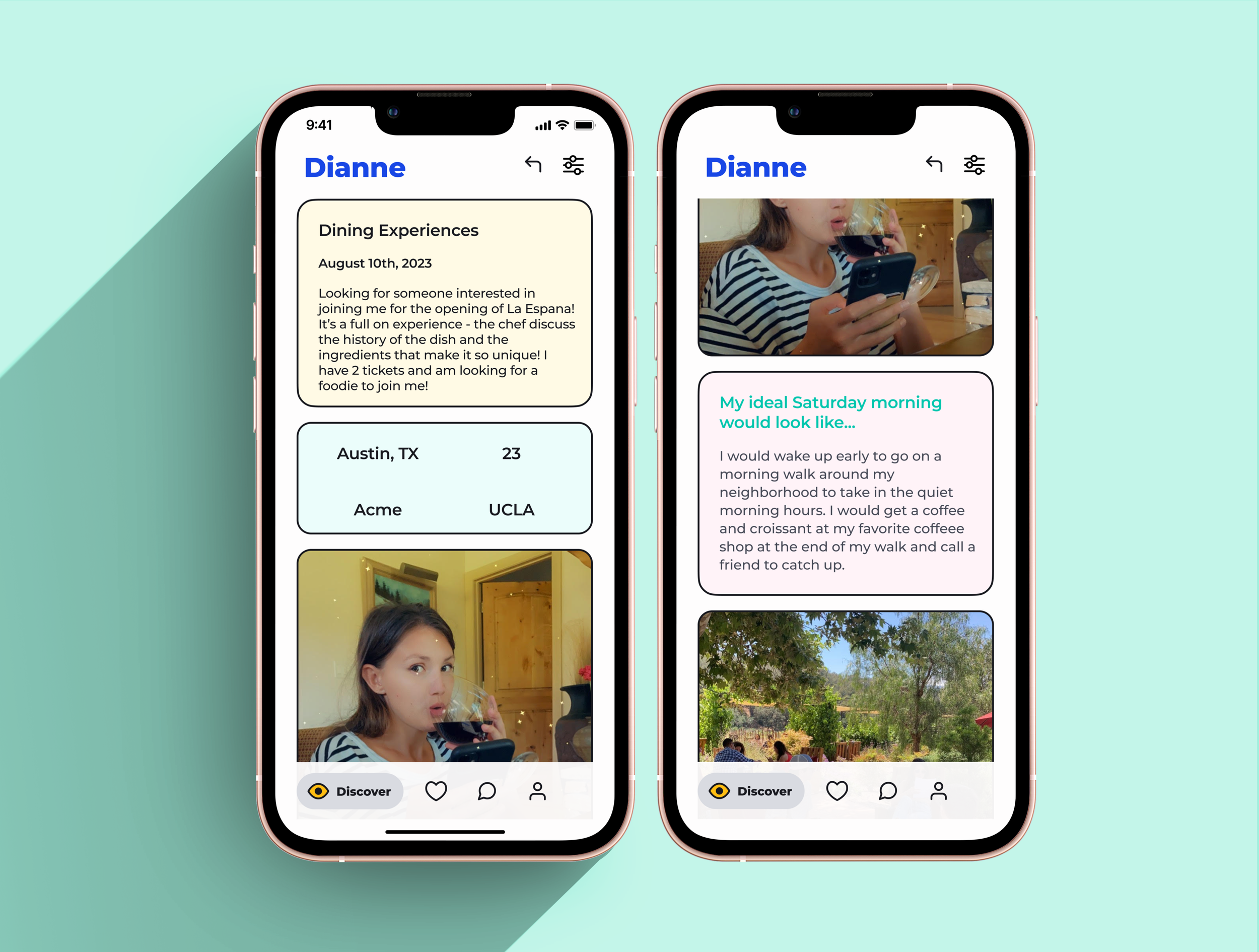
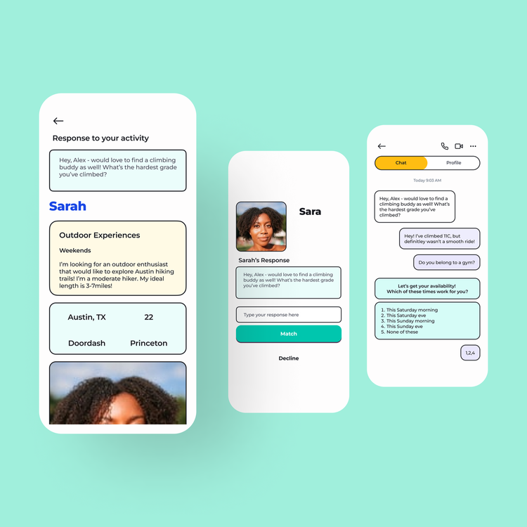
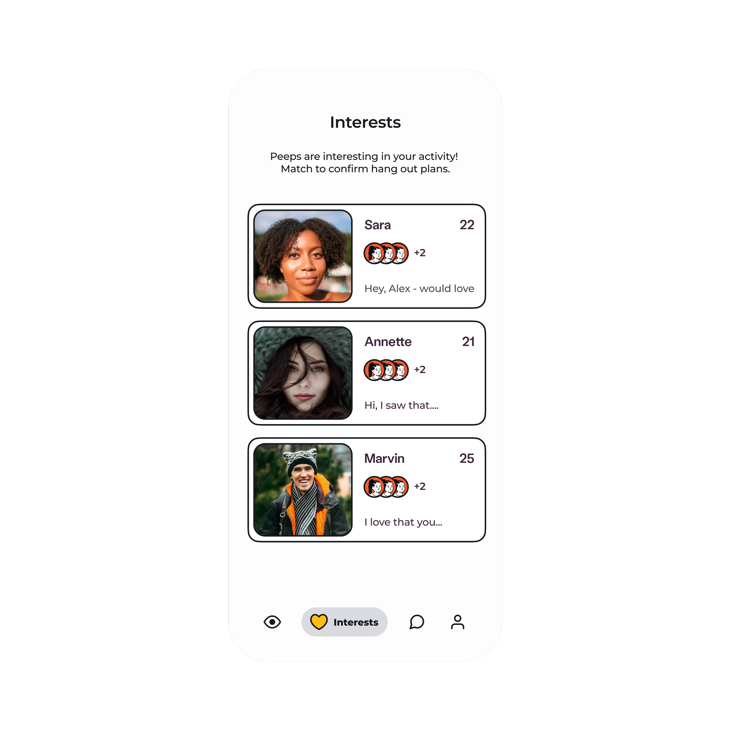
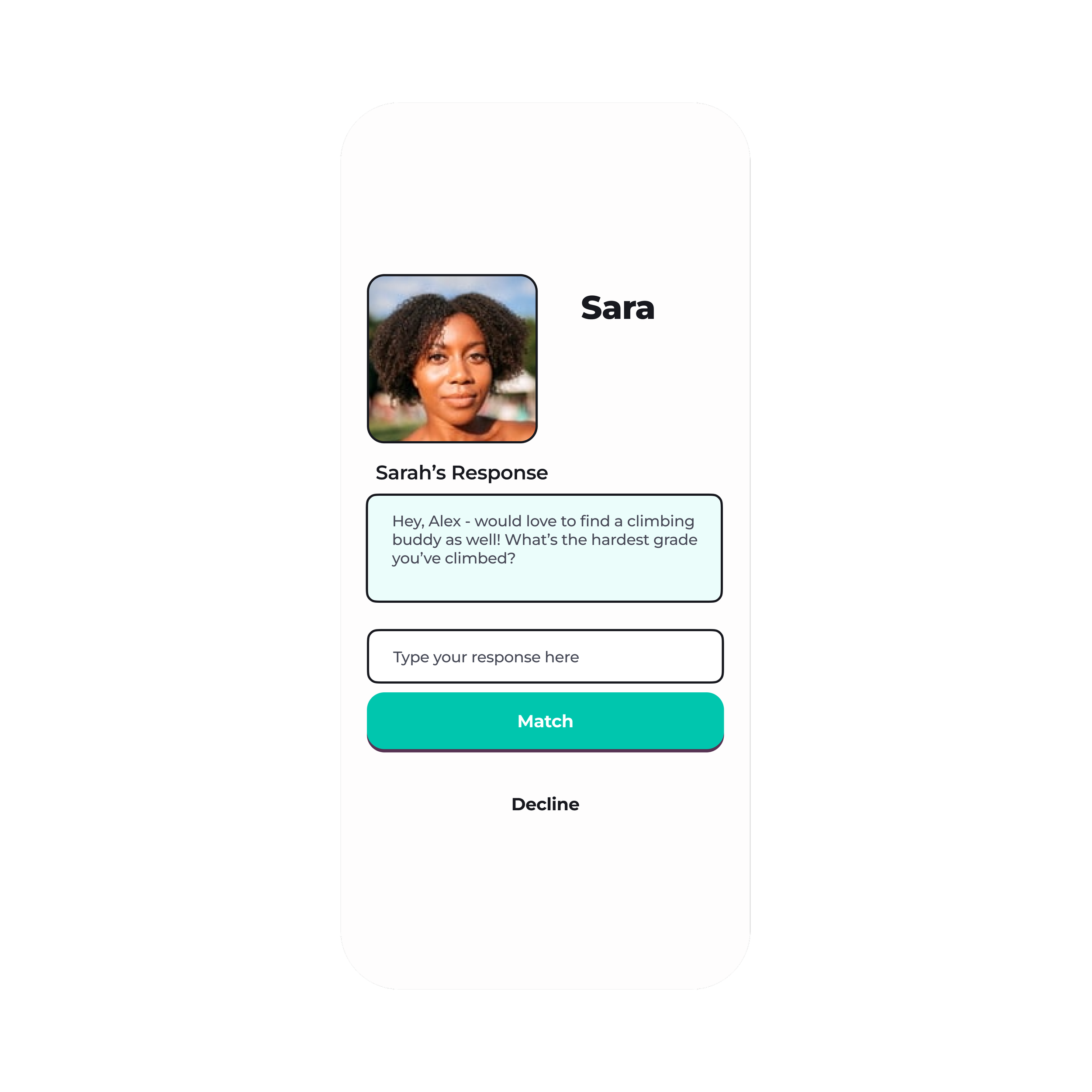
I began wireframing and decided to move forward with a response-based matching algorithm where a user posts an activity they want to do, and others respond to the activity to indicate interest. By requiring a response, we’re improving the quality of potential matches and facilitating a natural conversation.
Matching algorithm: When reviewing potential matches, the users I interviewed had difficulty gauging compatibility from a bare profile and a handful of photos. The lack of data impacted the quality of the initial conversation and made it difficult to build a connection. Users should know what activities their potential matches are interested in doing with them and focus on transitioning the connection to real-life hang out.
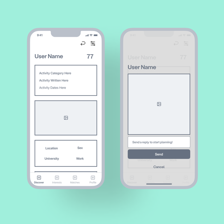
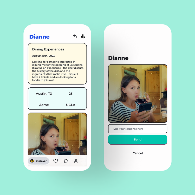
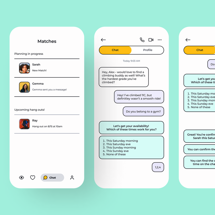
Chat: Beyond allowing users to post an activity they’re interested in doing with someone they meet on the app, to have a match, a user must review the profile of the user who sent them a reply to their activity post and decide if they want to match. If a user accepts the response, this automatically opens a new chat with the match where they can continue the conversation. The goal is to make the intro conversation relevant and interesting to both users so they can focus on planning their hang-out IRL.
Users who haven’t tried friendship apps were intimidated by the idea of having a one-on-one conversation with someone they know very little about. In dating apps, they can flirt and talk about something in their matches photo, but for a platonic relationship, they weren’t sure how to facilitate an interesting conversation that didn’t feel like an interview.
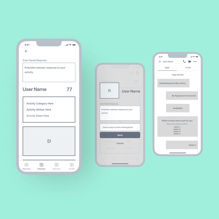
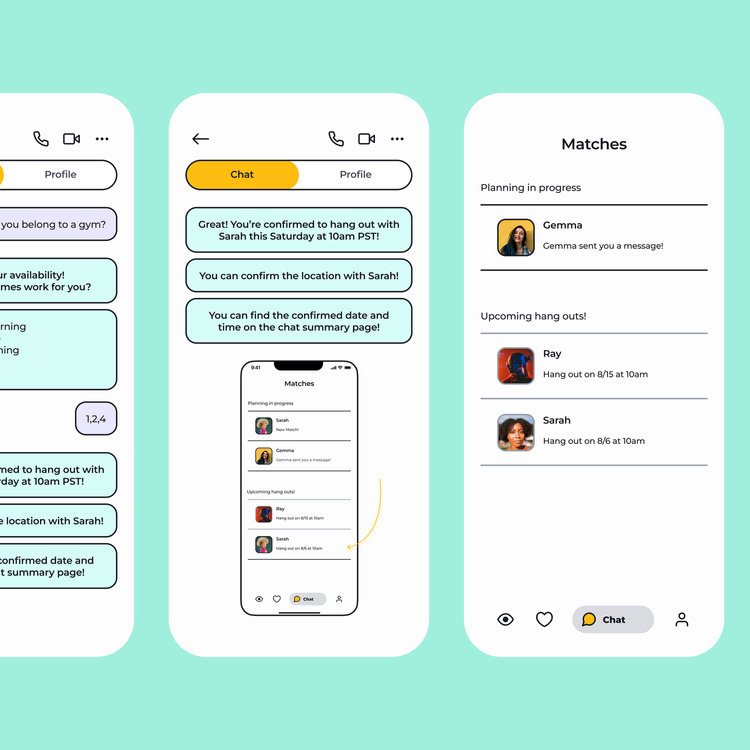
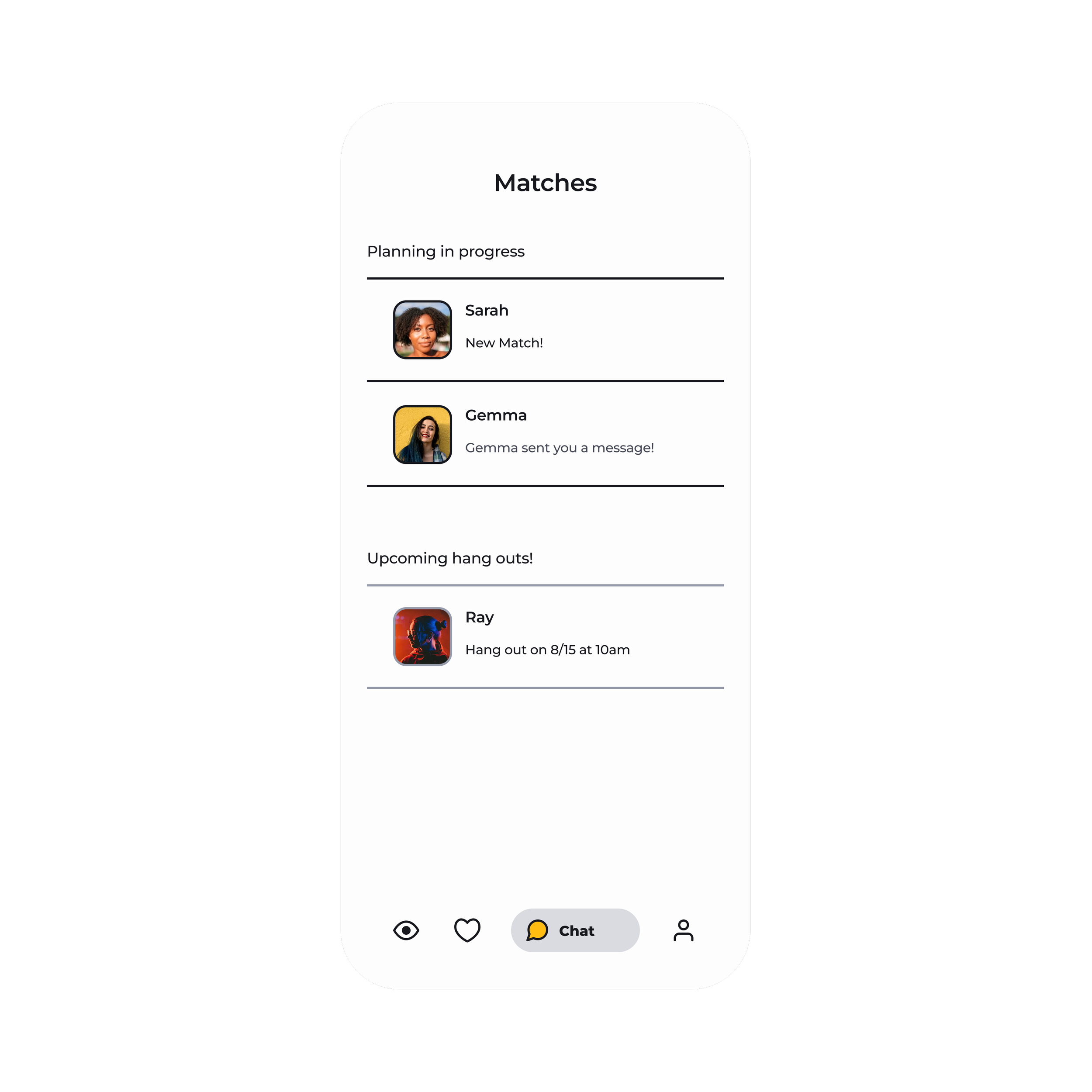
Planning Tool: Planning a hang-out was challenging and intimidating to the users I interviewed. Chats make it difficult to gauge friendship chemistry, so initiating an in-person hang-out can be intimidating for both users. The in-chat planning tool will gather user availability and interest in making in-person plans to make the transition more seamless.
03: Prototyping and usability testing
I did two rounds of testing to identify navigation.
I incorporated the following findings into my final design
Users found some of the navigation icons confusing
Users preferred that the planning tool history was removed after a plan was made so that it didn’t disrupt the conversation
Users wanted the ability to filter the discover screen by activity type (e.g., outdoors, events, dining, etc.)
-
![]()
Explore based on activity
-
![]()
Connect based on interest
-
![]()
No awkard introductions
-
![]()
Plan quickly
Learnings
Testing Early is Key
A major reminder from usability testing was icon ambiguity and its impact on navigation. My findings corrected the assumption that users would naturally understand how to navigate with icons alone and reminded me of the importance of seeking feedback early.
Balancing usability with design trends
Because I was targeting a younger generation with a consumer app, I had to pay extra attention to the UI design. My initial designs were a bit too busy, and folks didn't know how to navigate around. I toned it back to improve usability. I ultimately chose to keep a fun style and conducted extra testing to ensure the style was clean enough not to impact the users’ experience. This project reinforced the importance of balancing trending designs with usability.